UX/UI
Advanced Financials
Financial Management Software • Research • Testing • Prototyping • Personas • WCAG AA 2.1
Project Overview
Advanced Financials began a redesign of its entire SAAS application with the vision of becoming the No.1 Financial Management system in the UK.
The original plan was to reskin using the new design system. In the next section, I'll explain why this wasn't possible without creating a fractured user experience.
My Contributions
I was the sole UX Designer on this project and took the project from start to finish alone.

Colleague feedback
Tauqeer Hussain
Product Owner
“Since working together on the UI-UX project, you've been a great reference and support in constantly providing new ideas and providing the feasibility work to accompany the clean and modern layouts you've delivered.
Not only have the designs been clean, simplified, and consistent. You've gone through the effort of constantly being available to talk through the designs to help members of the team understand the 'why' behind the designs presented.
In an existing product where things have been done in a set way for years, you've provided fresh ways of looking at the UX from a customer-centric position, challenging existing ways of working and being open to ideas and feedback."
Project background
Advanced Financials was developed from a legacy product over 30 years ago. Since then it has grown into a Cloud offering without losing its legacy COBOL roots, this has caused many limitations
Over the last 4 years, Advanced Financials had several attempts to modernise but the time and scope of the project meant it always got deprioritised.
I joined this project on its third attempt at a 'simple reskin', it became apparent very early on that the new design system wasn't designed for over-congested screens. The design system takes on a more modern UI, with larger components and accessible font sizes making it impossible to create a like-for-like screen and fit everything on.
Advanced Financials UI when I joined the project


Understanding the problem
I spoke to a handful of customers wanting to learn how they interact with the current UI. I targeted the Account Payable Clerk persona and spoke to a mix of super-users and moderate-usage users. They walked me through the 'Raise a sales invoice' and 'Create a new supplier' workflow whilst I observed how they completed takes, and navigated the screen (mouse vs keyboard).
Learnings
-
A lot of functionality was being missed due to poor labelling, inconsistent layouts or the functionality being hidden behind a right-click menu
-
No interaction with the pull-down menus. One user described them as 'the invisible menus', and another thought they were something to do with the navigation.
-
Users can't tab through fields when inputting data because of the visual ordering
-
Knowing that accessibility was a big part of this project I created an accessibility statement as a benchmark
-
Users felt areas of the product feel like they were designed by different teams.
Challenging the scope
From these learnings, I needed to demonstrate that a simple reskin wouldn't solve any problems or create a UI that was easier to sell
3 possible routes
-
(Current) Straight reskin
- Carry across extreme accessibility failings
- Thousands of screens would break when the screen size drops below 1920px
- No user experience improvements
- On some screens its impossible to replicate the current UI with the new components
-
Template-level screen changes (Agreed approach)
- Address all accessibility failings
- Create a new consistent logic across all screens
- Uses the latest design system
-
Full UX audit: Workflow level
- All the points from the Template approach plus...
- Persona-driven strategy
- Will require backend changes
I created a mock-up to help stake holders visualise the issues I was explaining with a simple reskin


Discovery
Understanding the logic behind the current screens - the current UI uses a basic templated approach for different screen types (Amend/list/entry), customisation meant there were multiple ways of doing the same thing. Users showed they use a mix of both throughout the system causing more confusion.
Overview
-
All page actions appear in the top pulldown menu
-
The toolbar is built using page-type groupings
-
Footer actions have been manually applied by the internal team and have many inconsistencies with labelling a duplication of the toolbar
-
Right-clicking on the grid will give you a repeated set of pulldown menus plus more grid actions
-
Grid actions are mixed in with page actions or hidden behind right-click menus and double clicks actions
I asked the development team to run a SQL on Mapps to highlight what actions are list actions (Actions that are cell/line specific).
Then I start categorising the remaining actions

1. List action - An action that requires a row or cell selection
E.g. Approve
2. Page action - Action relating to an entire page
E.g. Refresh, drill down options
3. Primary action - Core actions that are consistent on every page
E.g. Cancel, Update, Search, Exit
4. Grid action - Actions that change the grid view or data
E.g Load more, View as code


'Hidden' actions that appear throughout the product
-
No mandatory fields until the user click 'Enter' to validate the inputs, an error state then appears on the mandatory fields.
Having the mandatory fields display upon page load is something I marked as a Must-have. Unfortunately, this required changes to COBOL which was out of scope due to the time it would add to the project
-
Some inputs have a fast prompt functionality when the user doubles clicks in the field (No keyboard option). This function is only visible with a hover state on the cursor.
-
Right-click menus override the browser defaults throughout the product
-
'Wildcard' searches are available in fields with underscores (I asked users about these fields in the initial calls, but none of the 8 users I spoke to understood what the underscores meant)
Ideation
Now I have the 4 action groups I started using flow charts to try and build a new action logic for where and how these actions are presented to the user.
At first, I used a digital notepad to scribble thoughts and map it out, once I had a solid concept to share I built a clear concise chart anyone could follow and apply to any MAPP.

Wireframe development
The 2 initial templates I needed to recreate were
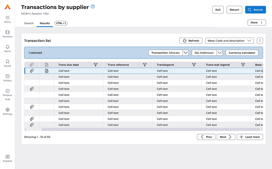
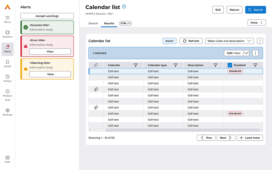
List screens
Used to search and retrieve data
MAPPS: Transactions by Supplier, Calendar list and Credit limit list
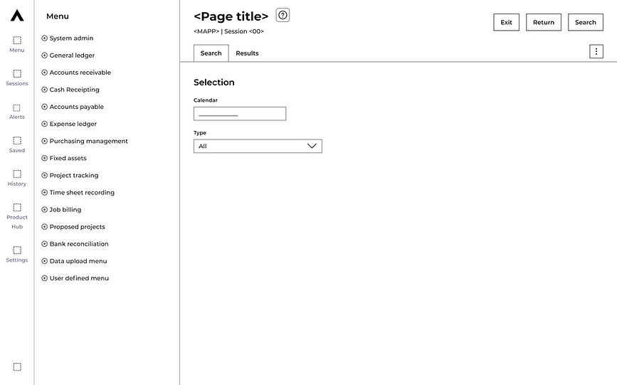
Data entry
Used to create new data entries
MAPPS: Create a new invoice, Journal entry, and Create a supplier
Creating consistency:
- Page tabs to split the inputs and data grids
- All inputs are vertically stacked
- Selection panel for all grid actions
- All page actions sit in the page kebab menu
- Primary actions in the header

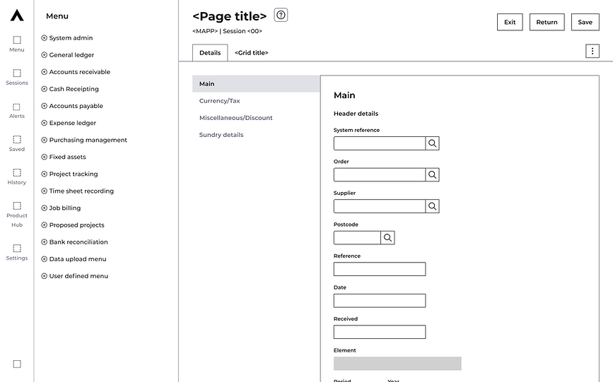
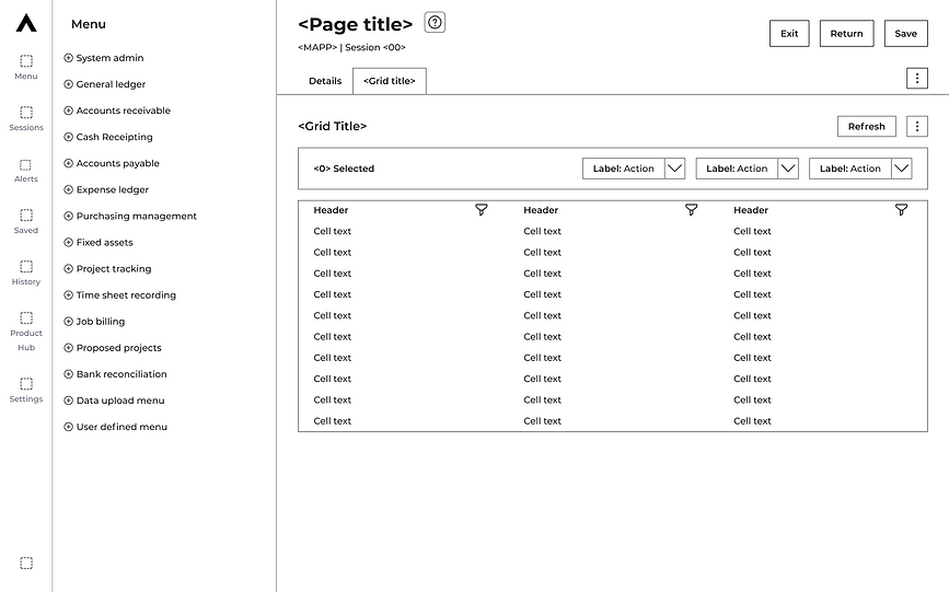
Designs
I needed to create new components and patterns within the boundaries of the design system to cater for functionality that we couldn't change without making changes to COBOL.
These include
- Page tabs
- Flyby dropdown
- Multiple input adjustments
- Selected panel with split buttons


User testing
I had 3 focuses for this phase of testing
-
Does the new action logic translate across all page types?
-
How quickly do users understand how the page tabs work for list screens vs data entry screens?
Scenario 1:
You have been given a new supplier detail, but first will need to check that they haven't already been added and are just waiting for approval.
Tasks included
-
Search suppliers
-
Create a new supplier
Scenario 2:
In your inbox is an email with all the details for an urgent invoice, input this invoice and submit ready for approval.
Tasks included
-
Invoice Entry
Results
The testing went exceptionally well, the users picked up the new action logic very quickly in the first task, remembered it confidently and applied it to the second task.
The testing highlighted 1 minor labelling amendment and a few comments about the number of fields on each screen that didn’t apply to their organisation (this is something I have fed back to the product team previously and was picked up separately using in-app analytics).
Now confident in the logic we created and the next set of testing should come closer to the first release. By then we use a demo environment with dummy data and can test validation, alerts and the data grid properly (this is something we can’t achieve using prototypes for testing).
Final designs