UX/UI
Cloud Engage
Fundraising Software • Prototyping • Personas • Feedback Sessions • Beta • WCAG AA 2.1
Project Overview
Cloud Engage sits within the Enterprise Resource Planning suite as a Fundraising solution. The product uses 1 template across all the major page types and recent user feedback suggested this made the product hard to navigate.
The goal was to create an identity across the product areas and use a beta release to gain user feedback early and highlight features to prioritise for the next iteration.
My Contributions
I was the sole UX Designer on this project and took the project from start to finish alone.
Understanding the problem
We focused on the Person template first as it has the highest traffic, we used personas to outline what tasks were being completed on this screen.
A group feedback session with a handful of users helped me understand user behaviours and needs.
Learnings
-
Users add 1-2 new contacts a week, updating data daily, and often just review the data for the mailing list (correspondence), and customer service requests
-
Most frequently added/edited 'Person' data: Payments, Membership and Correspondents (however this really differed depending on the type of charity)
-
Users heavily rely on the 'Jump to' anchor button to quickly navigate the page rather than use the scroll
Current UI across 3 screen types


Ideation
Based on the feedback from the group session, I started thinking about the areas of the page that aren't working for the users.
Initial ideas and thoughts
-
There are 30 grids stacked on the 'Person' page, can these be grouped to support editing/reviewing data?
-
How can we surface data for the users to view in an instance rather than jump around?
-
There is a lot of customisation to the 'overview' area, this must be flexible to accommodate
-
Users like the anchors because it speeds up navigation, if we start grouping data will this feel faster without the anchors?
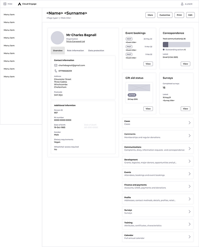
- A mini dashboard built from widgets highlighting key information from the data grids
- Customisable dashboard allowing users to surface the most relevant data for their company/role
- Group cards replace the stacked data grids to help the users navigate the data grids quickly
- Keeping the Overview/role/data protection data in tabs allowed each area to resize independently without affecting the position of the dashboard content.

- Using feedback from the group and product analytics we created 7 widgets
- All give a 'highlight' of its data grid and a link directly to the data

- The group card will take the user to a new screen with tabs for each item in that group
Design
As part of this project, the product is moving over to the new design system, which in part will resolve some accessibility failings.
The menu and top navigation were not part of this project**


User feedback from the Beta release
- Users liked the grouping but felt the full list was still quicker to navigate as they didn't have to remember or learn the groups
- A few minor changes to the data on the member, events and gift aid widget
- Users felt 4-6 widgets on the dashboard would be more useful
Design amends from feedback
Below are details of the edits I made off the back of the group feedback session, overall it was very positive feedback but it was clear we needed to review the navigation of the data grids again.

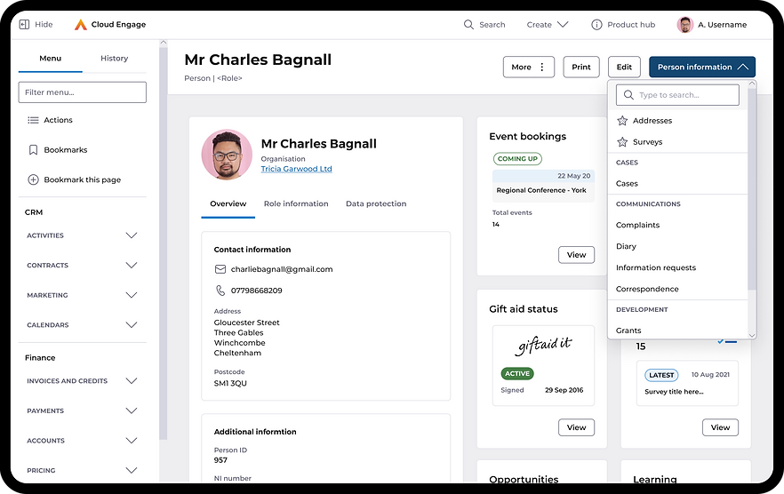
- I have removed the grouping cards and added a drop-down as the primary action for the page
- The new dropdown includes a search field and allows the users to pin their most used items to the top of the list
- Added the flexibility for 4-6 widgets

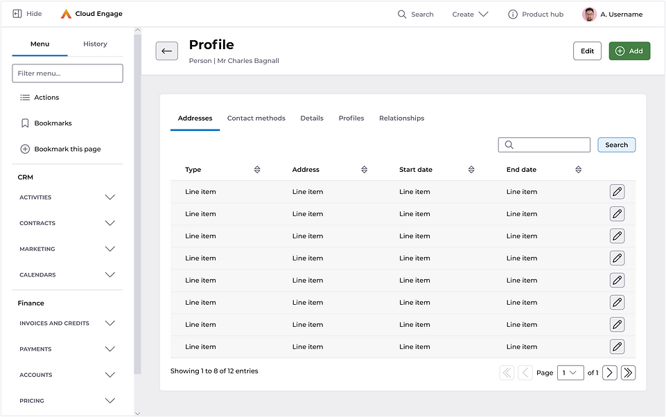
- Data screens match the navigation changes. We've lost the tabs and kept it to 1 data grid per screen
- The 'Person information' drop-down is repeated as the primary action for consistency and the grid actions are moved down to the content area